
This Article is Supported By:
Showcase your originality as a designer through sticker prints and capture potential clients with a well-designed business card. Visit UPrinting.com the online printer that understands the needs of designers.
will show you just that.
Tip One – Avoid Design Clichés!
It goes without saying that the most important thing to do to achieve originality is to avoid imitating clichés and design trends in your work. However, this is easier said than done when the internet is crammed full of design tutorials and inspiration posts that suggest we should base our work on pieces already created. Although these types of posts are essential for our growth and development as a designer, and of course inspiration is essential for any artist, it is important to ensure that whilst we are being inspired by other pieces, we are interpreting and developing them into our own style, rather than merely imitating them. To do this, we must steer clear of particular design trends that have been reproduced continuously across the net, and attempt to create new trends ourselves. After all, even the most reproduced and worn out design trends had to start out as original designs at some point. For example, take the Avatar franchise that started out as original designs and have now been imitated and reproduced by thousands of today’s designers. So what are the most common design clichés and how can we avoid them? Well if we see it on the net, then it’s been done, and admittedly I am guilty of some of the following clichés, but it is important to distinguish whether your work is for experimental uses or for the purpose of creating an original design. Here is a list of just a few of the most overused design trends seen today:Floral and Swirly Brushes
All too often do I see pieces of art lazily finished off and vamped up with free brushes found across the net. The most common being the dreaded floral and swirly brushes! Admittedly these can achieve nice effects, and can instantly add that extra something to your artwork, but it is ridiculously overdone! These brushes are free to download and available for anyone to use, and should only really be used when experimenting, in order to save time – but not when creating original pieces of design!
Eye Photo Manipulations
In ‘photo manipulation’ or ‘photo montage’ designs, several themes and symbols are frequently repeated across the net. One of which is the eye manipulation, again the effect achieved can be beautiful, but whether it’s a hand crawling out of the eye lid or flames, moons or water for pupils – it’s all been done!
Mystical and Futuristic Female Characters
Another overused design in photo manipulation is the use of mystical female (and sometimes male) characters. They are often placed in the design with no purpose other than being aesthetically pleasing, and serve no contribution to the overall message of the design. Obviously sometimes it is important to have human characters in your art to express certain emotions or create a connectivity with the viewer, but please ensure they serve a purpose rather than just being there for the sake of a focal point of the design!
Splashing/Fragmented Skin Manipulations
The third photo manipulation cliché seemed very popular throughout 2009 and I am constantly still seeing it across tutorials and pieces of design. This is the distortion of the skin with a splash/fragment effect where the skin looks like it is breaking apart. Visually stunning when it was first achieved, but again, constantly overdone.
Grunge Textures
The use of grunge textures is something that has been used for years now, and sometimes it can be used in innovative ways to achieve great effects. However, all too often I see it being used as a heavy, dark overlay to cover up the unprofessionalism of the work underneath it.
Background Gradients
Similar to overused brushes and textures, gradients are often overused as backgrounds for designs when the artist cannot think of anything else to put there. Photoshop gradients have many functional uses, beyond the aesthetic use, and should generally be avoided to cover space in designs.
In Web Design:
Similar to the clichés found across illustrations and photo manipulations, there are many overused trends that can be seen everywhere across the net in the form of web design.
Drop Shadows
Drop shadows are used in all sorts of areas of design to create a three-dimensional effect and make pieces ‘pop’. However, there are far more innovative ways to achieve this effect, as drop shadows often look amateur and lazy.
Rounded Corners
Rounded corners on boxes in websites are often used to create a ‘soft’, ‘friendly’ feel, but again it is way overdone and can sometimes look amateur.
Glossy Buttons
Glossy Buttons are famously connected with the apple merchandise, and instantly give an elegant, professional feel to a website. However, they have been imitated so much by websites that they now offer nothing creative and original, and even make the website seem cliché and boring.
This list is just a few of the hundreds of overused trends that can be seen across designer’s work. Sometimes they can be recycled to create new, innovative designs, but the general rule of thumb is to stay well clear of these clichés if you want to stand out from the crowd in the design industry. Check out the following design cliché parody by the guys over at makemylogobiggercream.com!
Tip Two – Create Your Own Distinct Style
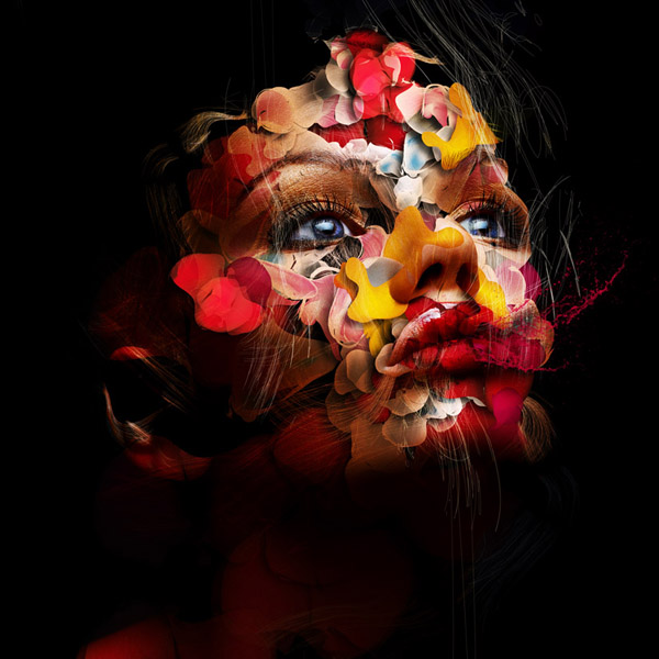
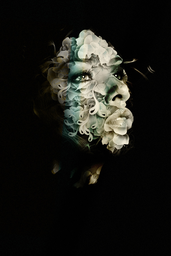
By definition, to be ‘original’, you must create something that is individual and unique to you as a designer. By creating a style that is instantly recognisable and connected to you, you are not only bringing a new area into graphic design, but you are making yourself recognisable as a product to the client. If they like your particular style and feel it would fit well with their campaign, they are going to choose you because the product you are offering is unique and they will not find that style anywhere else. If you are merely repeating styles and techniques used by top designers, then you are offering no more than the other hundreds of designers that are trying to do the same. Some styles may not be a huge success at first, but it is important to have a style connected to your name – proof of this success can be seen everywhere in art. For example, once you are familiar with the work of Salvador Dali, a piece of his work that you haven’t seen before is easily recognisable as belonging to him. It is exactly the same concept in graphic design, and many of the top designers have a distinct design style to offer. Here are my personal favourite top three successful designers with distinct styles:Alberto Seveso
Alberto is my personal favourite example of how an artist can create a distinct style. His beautiful skin manipulations in his portraits and illustrations are both visually stunning and sexually suggestive, creating a bold design statement across his works. His use of colourful vectors against monotonic portraits has become so distinct that the style has been coined as ‘sperm shaping’. It is this style and technique that has lead to Alberto’s success, where he has worked on several magazine covers and been noticed by companies such as Nikon who have wanted him to transfer his style onto their campaigns. View more of his designs on his Flickr or Behance.
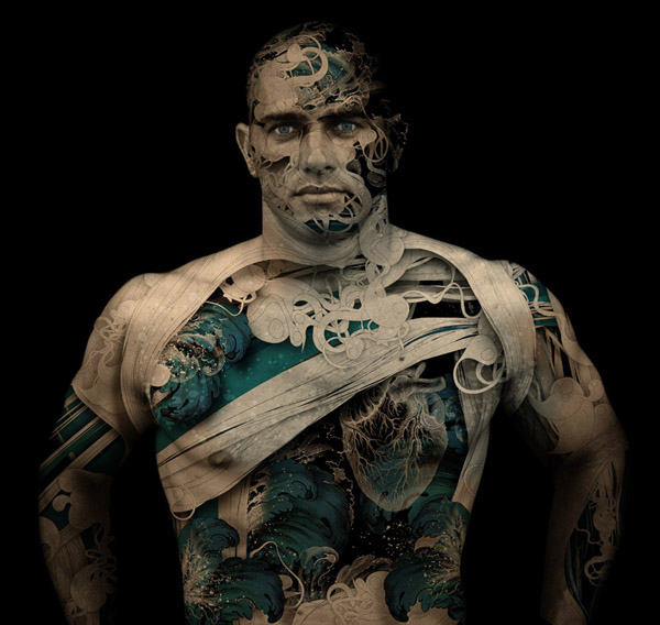

Christopher Haines
Christopher Haines is a young designer from Australia who’s blend between 3D modeling and photo manipulation is second to none. It is through this beautiful blend of mediums that Chris has created some truly outstanding works that have set him apart from the rest, allowing him to be the king of his own style. He is proof that it is possible to have your own style whilst still being versatile, as his work covers several areas of design. Here are just a few of his beautiful pieces, you can view more on his Behance.


Jerico Santander
I have included Jerico here because he is a good example of the correct way to be influenced by another artist’s style. You can see from his works below that he is highly influenced by the works of Salvador Dali, but at the same time he has transferred Dali into a new medium, whilst incorporating his own thoughts and style into the pieces. His use of fluidity in textures and his abstract take on portraits show characteristics and origins of Dali’s style, but develop rather than imitate it. More of his works can be seen via Behance


From all three of the above designers, it is clear how they have achieved a distinct style and made it unique to them. However, when creating your own individual style, it is important that you do not limit yourself to one particular area of design. Practice ways in which you can transfer your style to other areas of design, such as illustration, 3D, photo manipulation, typography and web design. Whilst it is good to present yourself as a unique product, it is also important to display a diverse range of works to prove to your client that you are versatile. Originality and success is finding the balance between your own style and a variety of works that display this. You can only achieve a style you are comfortable with by experimenting, which brings us on to tip three.
Tip Three – Experiment!
Tutorials are a big part of the graphic design world. They can be found on pretty much any graphic design blog, and new ones are continuously being produced. In fact, the majority of the skills I have learnt as a designer have developed from tutorials I have read on the net. However, once these basic skills have been learnt it is important to try and break free from producing effects presented in tuts. By creating works based on tutorials we are merely imitating a popular style that has gained enough attention to be taught to designers. So how can we achieve effects that are original and therefore create this unique style that I have been talking about? By experimenting. So often when I am scouring the net, I come across the work of the designer that instantly makes me say ‘wow’, as it is something that I have not seen before. This leads me to wonder how they achieved these effects, and the answer is through experimenting. By experimenting with our work we can achieve great effects and develop them into our own personal style. But we have all at some point sat at Photoshop attempting to experiment with the features and ending up with something looking like it’s been created by an infant. So how can we experiment correctly and use it to our advantage? Well this brings me back to those ‘wow’ factor pieces of unique work that we often come across. When you come across an interesting effect from another designer, try and achieve this yourself without the use of any tutorials. Now I know this idea of copying another artist’s work goes against everything this article stands for, but remember it is for experimental purposes rather than publication. By playing around with Photoshop and attempting to achieve other artist’s effects, we can then develop this into our own style, and learn how to achieve a unique effect of our own.A further use of experimenting is to combine the techniques that you have already learnt from tutorials and various sources and experiment to achieve something new. When doing this, try and break from typical conventions of graphic design. More and more often we are seeing pieces that incorporate techniques from more than one area of design, for example my previous reference to Chris Haines’s blend of 3D and photo manipulation. This is being taken further on all levels, with illustration, typography and even sketches being incorporated into artwork. For example take a look at these Clubmaster ads for Ray Bans that recycle an 80’s retro feel by collaborating several different techniques into one.


All of these stunning effects were achieved through the artist’s experimentation, and can be developed further into endless possibilities. At times as a designer we lack inspiration and it feels as if every theme and area of design has been covered by other artists. However, there is always room for development and expansion. Art has been around since the beginning of time in several different forms, and will never cease to stop growing, as long as individuals continue to bring originality and unique perspectives to the field.
Conclusion
I hope that my 3 tips have helped inspire your own originality in your designs. I think the main importance is to impart a part of yourself, as no two people are the same, and if this can be translated into design then you will have achieved your own style. This can be difficult when working for a client who will obviously have set ideas about what they want you to express, but when creating pieces for the sake of art, never be constrained by the conventions and trends of the design world. Always try and manipulate your own style out of your work, and most of all be happy with what you have created and the message it portrays. If you are not happy with your art yourself, then it will be even harder for anyone else to be.Let me know your thoughts on how you ensure your pieces are original, and follow me on twitter, or view more posts on design and style on my new blog!
No comments:
Post a Comment